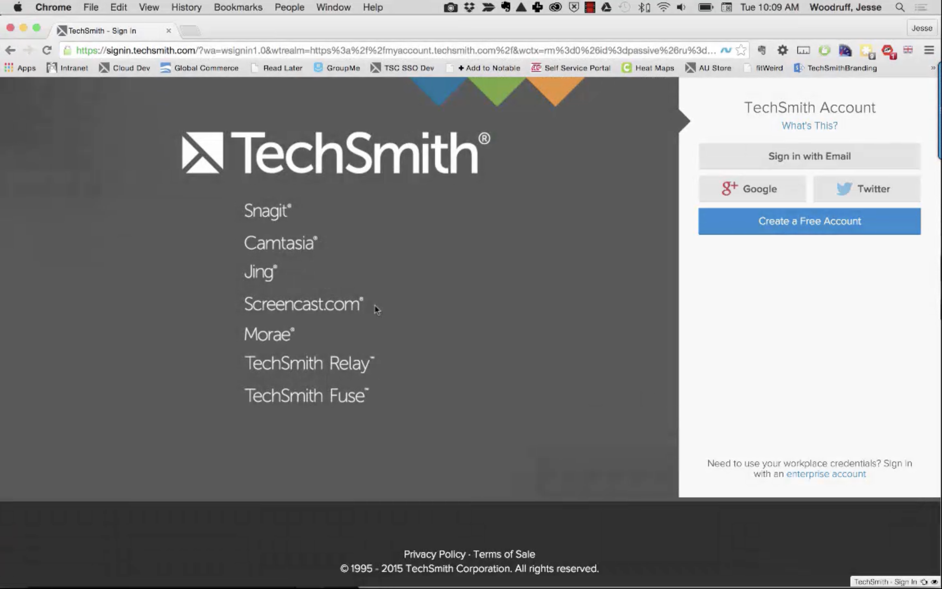
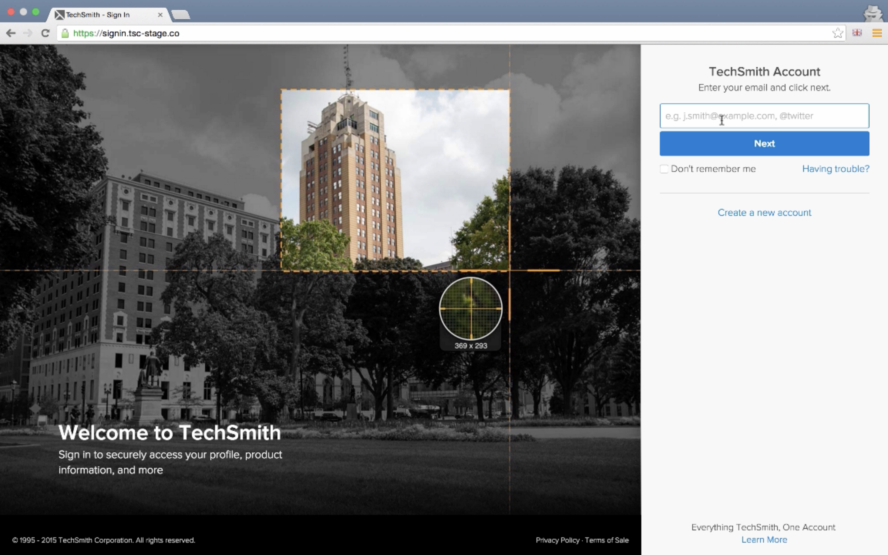
Drag the slider up and down to see before and after changes to the primary Sign In page.
Improving the User Sign-In Experience
The challenge of refining the sign-in process is a common one in the realm of UX, yet it holds profound implications for user satisfaction and engagement. This case study delves into the efforts undertaken to address and rectify the issues surrounding the sign-in and account management flows at TechSmith. The initiative aimed to eliminate user confusion, reduce failed login attempts, and streamline the authentication process for both internal and external users.
Challenge
Feedback and data analysis revealed that users encountered significant difficulties with the sign-in process, with as many as 40% of attempts to sign in failing. The complexities arose from a combination of factors, including a confusing workflow through Windows Azure Active Directory, the possibility of multiple authentication methods linked to the same account, and the remnants of a legacy account system. These issues not only hindered user access but also impacted the internal team's perception and efficiency.
Solution Strategy
The cornerstone of our approach was the development of an identifier-first login workflow. This design decision was driven by the hypothesis that simplifying the initial step of the authentication process would prevent common errors and reduce confusion. To validate the necessity of this overhaul beyond internal feedback, we implemented enhanced tracking for login attempts. The data collected confirmed the urgency of addressing the login failure rate.
Implementation
The project encompassed several key improvements:
- Identifier-first workflow: Allowing users to provide the information they are most likely to remember allowed us to guide them down the right path while addressing security risks with behind-the-scenes measures.
- UI Refresh: Updating the UI for both the sign-in portal and the account management pages to create a cohesive and user-friendly experience.
- Iterative Development: This project was follow up work after the initial implentation of the service for Product Unlocking. It served as a valuable lesson in deploying incremental updates, allowing for more manageable releases and adjustments based on real-time user feedback.
- Additional Iterations: Further iterations of this process included removing embedded webview logins from installed products, instead redirecting user to sigin in through their browser, where they were more likely to already be authenticated, fruther reducing friction by eliminating unneccessary attempts.
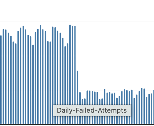
Daily Failed Sign In Attempts

Daily failed sign in attempts over the course of a year. The large drop midway through is the impact of the identifier-first workflow.
Outcomes
The redesign led to a decrease in failed sign-in attempts, with only 17% of attempts following after our changes, while we experienced a slight rise in the volume of successful logins, indicating that users were generally succeeding on their first attempt. Additionally, specific adjustments to the internal authentication system effectively dissolved the confusion among the staff, showcasing the importance of distinct visual and functional cues in differentiating user flows.
This project underscored the significance of user-centric design in solving operational challenges. By focusing on simplifying the sign-in experience, the team not only enhanced user satisfaction and access but also gained valuable insights into the iterative design process. The success of this project illustrates the transformative power of UX design in creating more inclusive, accessible, and efficient digital experiences.
Prototype Walthrough for Stakeholders | 2015
Pre-publish Walkthrough of Solution on Stage | 2015
Case Studies
